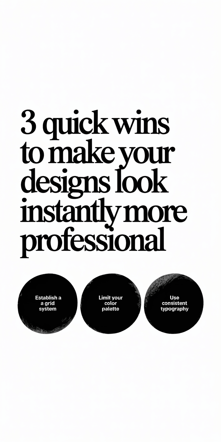
3 Quick Wins to Make Your Designs Look Instantly More Professional

This website contains affiliate links. As an Amazon affiliate, I earn from qualifying purchases, our own services and products. This tutorial is an independent guide and is not affiliated with, sponsored, or endorsed by Canva Pty Ltd. All product names, logos, and interface screenshots are used for identification and educational purposes only. Canva is a registered trademark of Canva Pty Ltd. Screenshots are used under fair use for the purpose of commentary and instruction.
Honestly, most people who come into contact with Canva for the first time don’t consider themselves to be designers or artists in any real sense of the word.
They are simply looking to improve the appearance of their social media posts or the designs for their small businesses, in order to make them feel a bit more elegant and professional than they currently look.
I can completely see why that’s so.
I know that feeling very well. When I started out in graphic design on my own, one problem was that my creations were not poor per se, but they were still far from being good enough, with quality easily distinguishing them from professional work.
I used a variety of different typefaces, combining fonts in a hit-or-miss attempt to achieve a sense of variety.

Every color that caught my fancy found its way into my designs, and I cherished the hope that, at some point, everything would come together. Unfortunately, that day never came.
I came to realize that a homemade design is always distinguishable from professional graphic design, not because of innate talent or intelligence on anyone’s part, but rather because of the valid virtues of consistency, alignment, and moderation that apply to any design choice.
In this part of the series, I can offer three simple rules, along with a number of professional tricks, guaranteed to ensure an immediate transformation in the quality of your designs.
No expensive design software or years of formal training are needed. Things like focused intention make a difference. With a few minor adjustments, all your work can become professional-grade.
Why Consistency Is Needed In Professional Design
Before we can discuss colour palettes and font choices, let us first establish this most important of design principles, the unifying link that connects all into one cohesive whole.
No sustainable system will work without carrying through on some level or with consistency. Therefore, it is crucial that your graphics correspond with the voice of your brand.
If its visual elements are constantly changing, altering from one font set to another, using unpredictable colors, and adjusting page layouts every week for no apparent reason, the public is bound to become confused.
A unified and consistent visual atmosphere reinforces confidence among your audience.
Seasoned designers will tell you that the power of good design lies in its imperceptibility. It is balanced, clean, authoritative, and rife with a confidence stemming from every single one of those design elements having been fastidiously aligned to your brand’s unique image.
That’s how you do it:
- Choose a colour palette that effectively conveys the message you want to send. Stick to no more than 2 or 3 colours at most.
- On every system and in multimedia, use the same fonts.
- Stall those design elements, titles, text, or logos from constantly appearing in the same places. Make them predictable and both familiar and familiar from before.
Even if you are just embarking on your design journey, adhering to these simple rules will immediately enhance the professional appearance of what you create.
How to Use Fonts Like a Professional Graphic Designer
Fonts are the arteries of visual expression. Appropriate typography can make your message clear and easy to understand, while an incorrect choice will make it instantly unattractive to your audience.
Initially, when I delved into the rich world of fonts, I chose to mix all kinds: serif, script, all caps, and various decorative styles.
What I created seemed cheerful and chaotic. I didn’t realize that each font had its own unique character, nor that combining too many different styles together could actually confuse rather than unify a piece.
The design principle that I wish someone had told me earlier was this: stick to two fonts, use one for headers and the other as body text.
Choose a title that matches the tone of your brand. You need a strong, self-confident headline font.
And couple it with a clear, readable font for the body text that can be read on all devices and scales of white space.
If you’re unsure where to start, Canva offers a fantastic range of ready-made font pairs. However, the most important thing is to maintain consistent typography throughout your entire design.
Top tip: By using larger heading sizes, medium-sized subheading fonts, and standard body copy fonts, a visual hierarchy can be created that helps the eye naturally move through your content.
Why Spacing Is the Unsung Hero of Good Design
Every tried-and-true design professional knows: good design doesn’t necessarily mean placing or adding some object into a design; deleting is just as important.
I used to fill every available inch with something, but that was because in those early days of my design career, I had an irrational fear of creating an ’empty’ design.
Yet what I learned over time is that it is not emptiness to be dreaded; instead, it signifies clarity and confidence in design.
This idea is often referred to as “white space” (or negative space), and it is the very element that lends balance and breathing room to your designs.
When text or pictures are compressed into a minimum amount of space, the result is one hot mess of clutter. Nobody will look at it because it’s too hard on the eyes. You need to secure your design and give it room to breathe.
The following is a collection of user-friendly ideas and ingenious techniques to help you improve your graphic design skills:
- Spacing is constant throughout your design
- Use gridlines to ensure text and icons are perfectly aligned.
- Add a margin around your text boxes so that your words never touch the edges.
This approach enables your design to appear planned and cohesive, rather than haphazard.
How To Select Your Brand Colors
In the case of pattern color, it is because a particular color is repetitive; however, more important is choosing a color palette that resonates with your audience.
Then work your design ideas through it, followed by considerations for print production and compilation for printing on paper.
That said, colors have the ability to influence people’s emotions and perceptions. For example, blue is a color that often evokes feelings of trustworthiness, while red conveys an impression that something needs to be done quickly; green gives off an aura that is quiet and comforting.
By limiting your design to just two or three brand colors, you are creating harmony and cohesiveness within your visual identity. Canva’s Color Palette Generator is an excellent resource for finding color combinations that complement each other.
Here’s how to select your brand colors:
- Choose one dominant color to be used primarily in visuals or headers.
- Choose a neutral base color, such as white, gray, or beige.
- Choose one accent color to be used in addition for emphasis and visual interest.
Once you have settled on your color palette, be sure to keep the HEX codes on hand for future reference.
Use these codes in every project, from your social media graphics to marketing materials. Over time, your audience will come to know your brand aesthetic before they ever see your logo.
Understanding Visual Hierarchy (and Why It Matters)
If design had a golden rule, I’d say do anything to guide the viewer’s eye.
This is the essence of visual hierarchy; you arrange design elements in such a way that your audience immediately knows where to look first, which information is most important, or where their eyes should move next.
For instance, your heading must effectively draw attention, followed by the text itself and relevant visuals. If you experiment with size, contrast, and position well enough, focus can be directed powerfully.
Professional graphic designers do not rely on flashy effects to convey their message; instead, they carefully employ hierarchy. This means using big, bold headings in your main areas of focus, with smaller body copy surrounding them, but still clearly defined as such.
When you create designs that incorporate visual hierarchy, your content will appear more professional and legible to the reader.
Simple Tips to Improve Your Graphic Design Skills Quickly
You don’t need years of experience to become a capable designer, but you must consistently adhere to basic design principles.
Here are a few practical tips and tricks for improving your design skills:
Study other designs of outstanding quality to see how branding that you admire uses spacing, typography, and color schemes for maximum effect.
Try out different layouts. By changing one element at a time, you can see how it affects the overall aesthetic.
Keep it simple. Remove any extraneous elements from your designs that do not add value or detract from the quality of what you are trying to produce.
By making these small design alterations, your created works will become more cohesive, they will look well thought out and considered.
That is how you can make your design appear as if it were produced by a truly capable professional graphic designer, rather than being put together from templates in Canva.
How To Create Balance In Your Designs
Balance is one of the design principles most often forgotten.
If your layout lacks proportion or seems uneven, it can cause the viewer’s eye to become confused.
Thus, one feels a lack of rhythm in art; spacing, colors, and forms don’t look harmonious. When things are well balanced on all fronts, with all these elements coexisting in unison, calmness, soothing, and even trust are renewed.
To create a well-balanced design:
- Ensure visual weight is evenly distributed. If one side shows a large picture, balance it with text or negative space on the other side.
- Avoid using highly saturated colors in a small area.
- Use the alignment function to center your elements perfectly.
Balanced design doesn’t have to mean symmetry; it is about ‘all things in harmony’. The whole design should look stable and consistent.
Why Every Time in Graphic Design Simplicity is the Best
When critiquing the work of a new designer, I often notice a common issue: an overabundance of elements. Too many fonts, colors, icons, and effects clutter the visual message. Loads of extra symbols also clutter the message.
If you can strip away the superfluous elements, your work will suddenly have taken on an air of sophistication and high quality.
A simple design does not mean uninteresting. It communicates confidence and leaves room for the message to take center stage.
Remember that old saying: Luxury is white space.
As a graphics designer, and indeed as someone involved in designing things but not formally trained in design, your goal is to make an elegant point with as few words as possible, rather than filling pages with colorful splotches that don’t really matter.
So next time you sit down to create a layout, maybe take a second or two longer before stopping. And then a little longer still. That’s where professionalism is viewed in a new light.
Thus, as a brand, the design must be consistent.
A solid brand concept turns this good design into a recognizable logo.
Every piece of design you create, from social media graphics to company logos and even PowerPoint presentations, should be considered a segment in a larger narrative. This means that you will always use the same colors and font equivalents, and apply the same spacing rules whenever possible.
This is the solid foundation upon which recognition is built. None of your work may be recognized at first if you wobble between different styles and looks.
Don’t aim for perfect design, but rather a familiar design. When your brand maintains a consistent look in the eyes of different people, strive to convey a similar message.
Final Thoughts
You could be a small business owner or a creator, but your goal is not to become a professional designer overnight.
However, to know at least the basic design principles that support one another in the visual elements of the production set, which come together to look and measure effectively.
After a while, these habits of yours, like finding unity in fonts, creating a balanced layout, and making more careful palette selections, become second nature.
You suddenly realize that your graphic design has quietly evolved over a period of time, though you were not even aware of this.
Although your audience may not notice the subtle changes you make to a design, they are undoubtedly aware of the change itself.
So open Canva. Pick your fonts. Set your colors. Get those edges straight.
Then, take a moment to reevaluate your finished designs once again.
That’s how to come across as polished in your design work, like a real pro!
This website contains affiliate links. As an Amazon affiliate, I earn from qualifying purchases, our own services and products. This tutorial is an independent guide and is not affiliated with, sponsored, or endorsed by Canva Pty Ltd. All product names, logos, and interface screenshots are used for identification and educational purposes only. Canva is a registered trademark of Canva Pty Ltd. Screenshots are used under fair use for the purpose of commentary and instruction.


