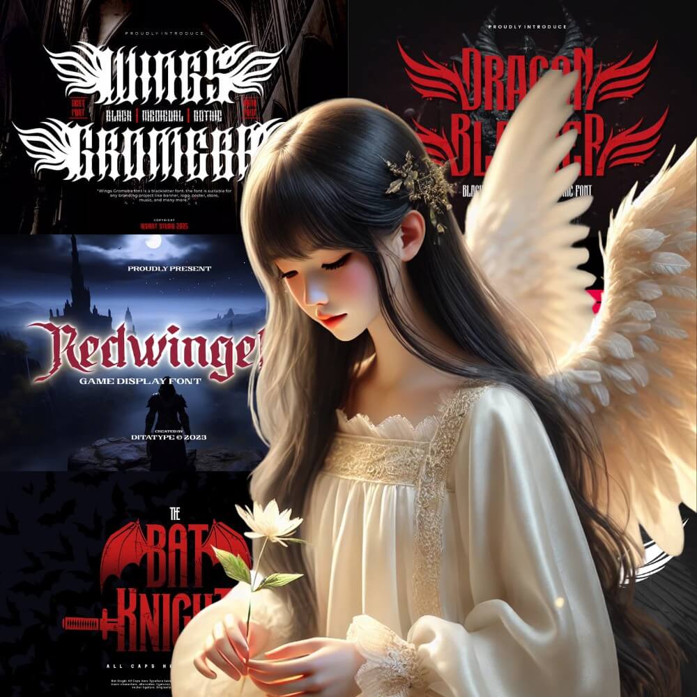
7 Fonts with Wings
This website contains affiliate links. As an Amazon affiliate, I earn from qualifying purchases, our own services and products. This tutorial is an independent guide and is not affiliated with, sponsored, or endorsed by Canva Pty Ltd. All product names, logos, and interface screenshots are used for identification and educational purposes only. Canva is a registered trademark of Canva Pty Ltd. Screenshots are used under fair use for the purpose of commentary and instruction.
If you’ve ever looked at your text and felt like it needs a bit of a lift, a bit more movement, or just some magic, then wing fonts might be exactly what you’re looking for.
In this guide, I want to take you through the realm of wing typeface styles, why and where they matter, and how to download them without burying yourself in an onslaught of choices.
Looking for inspiration? Turning to feathers, birds, and butterfly wings, with modern black-and-white details that make your text look expressive?
This guide shows you how to bring your words to life! If you want your fonts to take off, this article is highly recommended.
Wings Gromeba
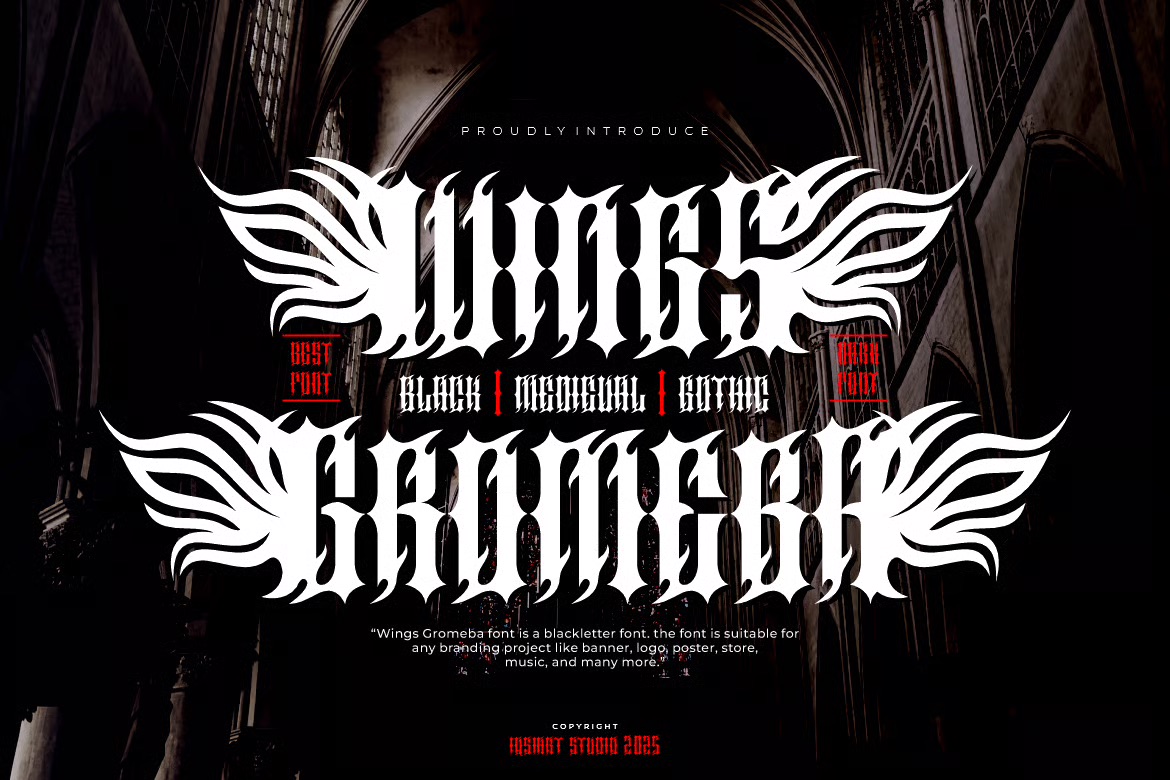
Wings Gromeba has that bold gothic vibe that instantly grabs attention. It feels dramatic and powerful, perfect for designs that need a strong statement. I like how it mixes medieval flair with a modern edge, making it great for posters, tattoos, or music branding.
Wing Label
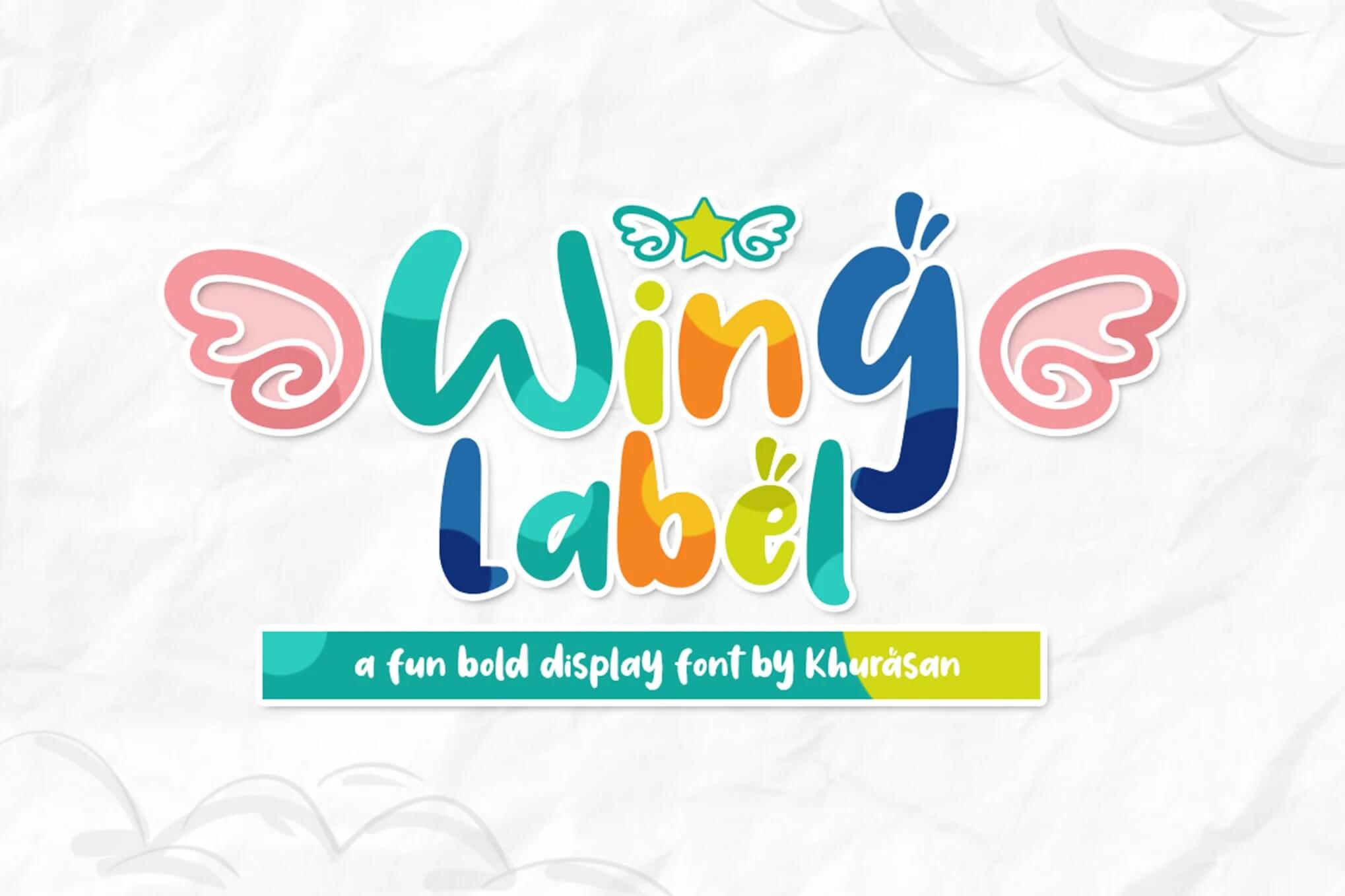
Wing Label feels bright, playful, and full of personality. It has that cheerful, hand-drawn vibe that instantly lifts your mood. Perfect for kids’ projects, fun branding, or anything that needs a happy touch, this font really brings a friendly energy to your designs.
Dragon Blacker
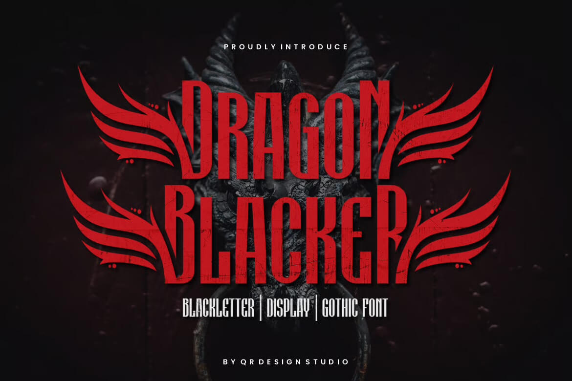
Dragon Blacker has that bold, dramatic vibe that instantly grabs attention. It feels powerful and a little mysterious, perfect for posters, logos, or anything that needs a strong presence. The sharp lines and gothic flair make it stand out in the best way.
Bat Knight Typeface
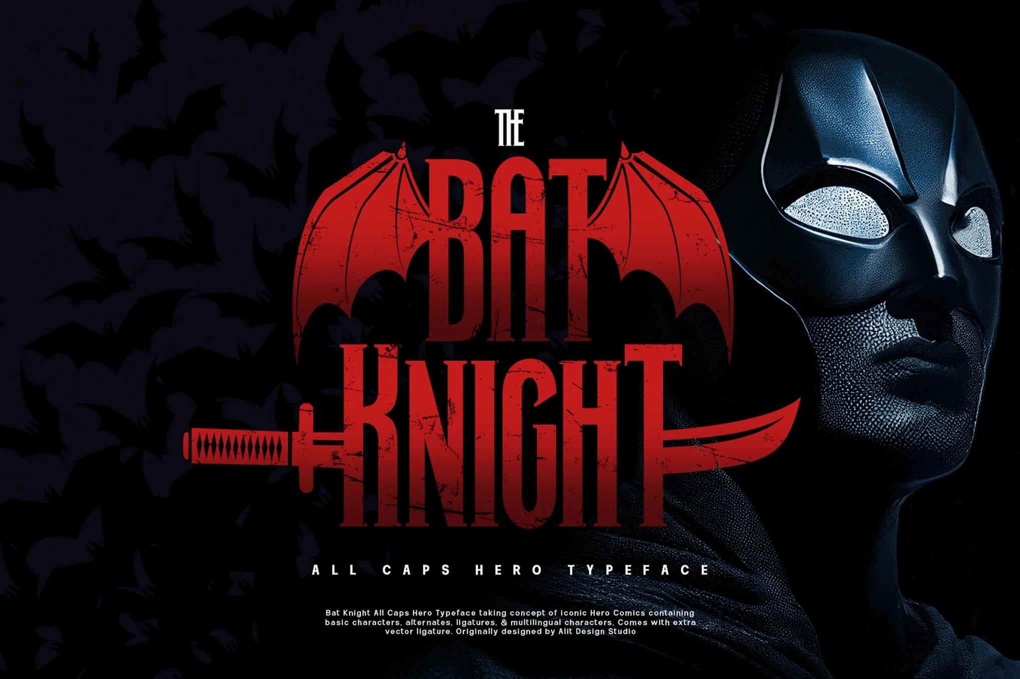
Bat Knight Typeface has a bold, cinematic vibe that instantly evokes epic battles and fearless heroes. It’s strong, dramatic, and perfect for titles or designs that need a touch of power and mystery. Definitely a font with attitude.
Winged Words – Tattoo Font
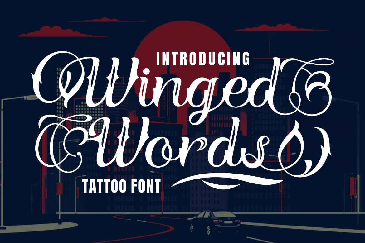
Winged Words is a bold tattoo-style font that instantly grabs attention. It mixes gothic charm with artistic flair, making it perfect for logos, posters, or anything that needs a dramatic touch. The curves feel powerful yet elegant, giving every word a confident edge.
HunterWings
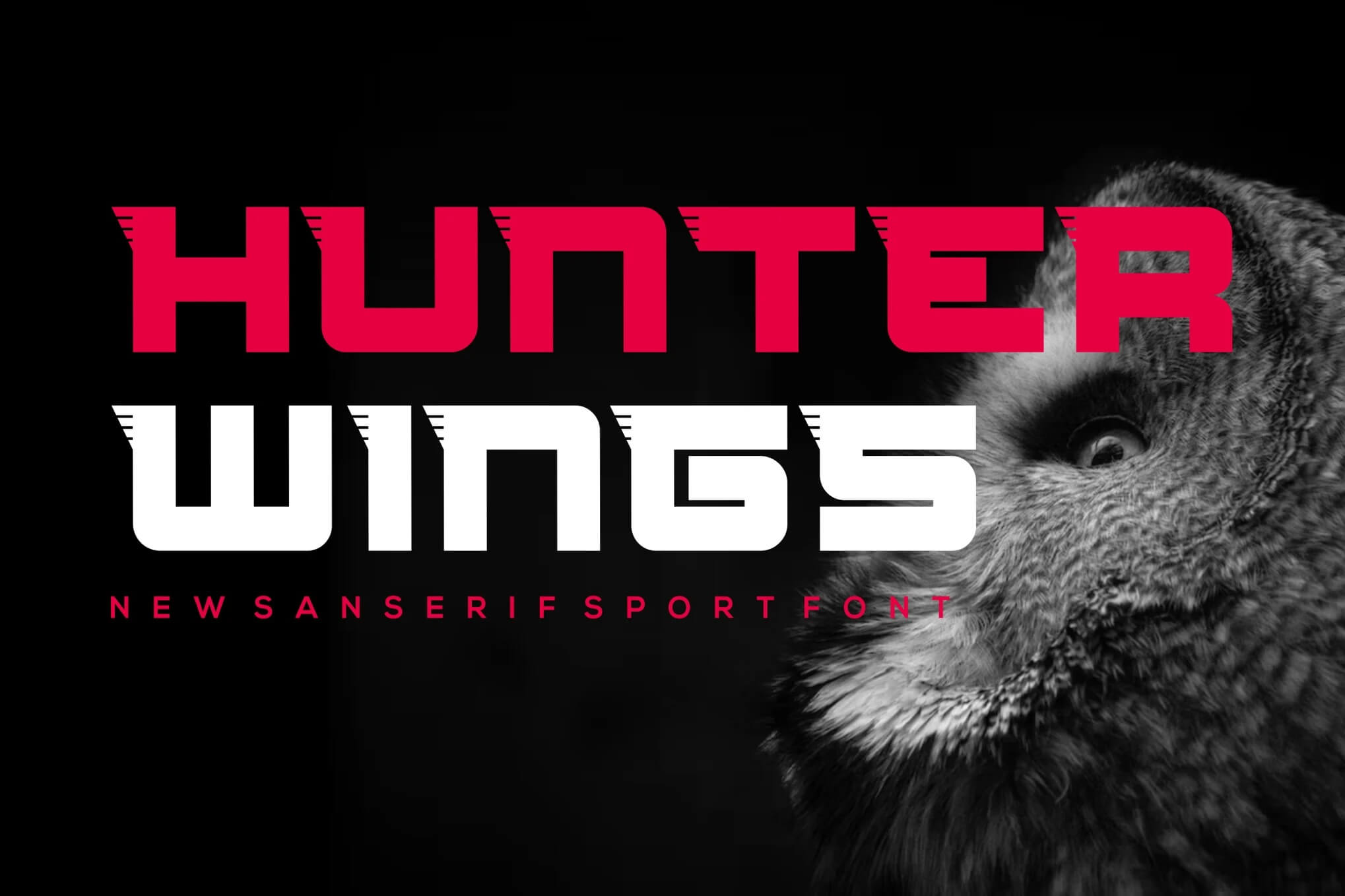
HunterWings has that bold, futuristic vibe that instantly grabs attention. It feels sharp, confident, and perfect for projects that need a strong visual punch. I can totally see it on esports logos, tech branding, or anything that wants to look powerful and modern.
Swiwings Bakar – Typeface Font
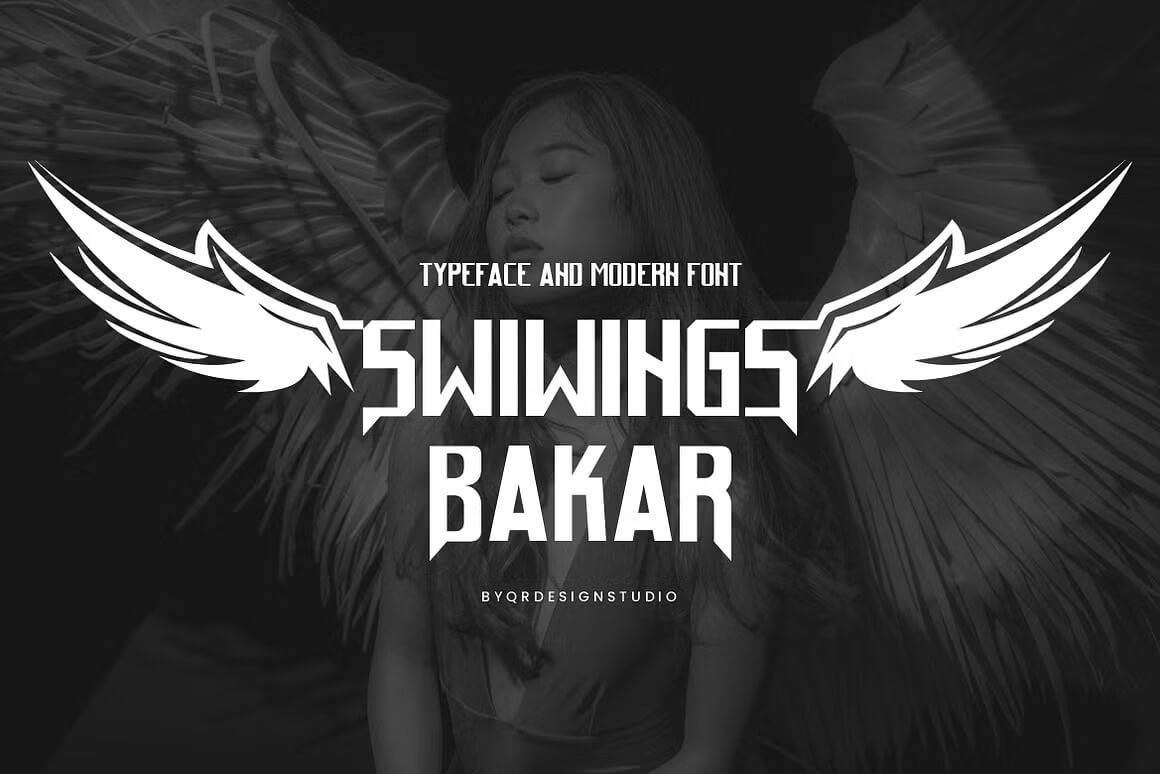
Swiwings Bakar has that bold, confident vibe that instantly grabs attention. It mixes a modern edge with a classic blackletter feel, making it perfect for logos, posters, or anything that needs a strong statement. It’s stylish, sharp, and full of personality.
Redwinger
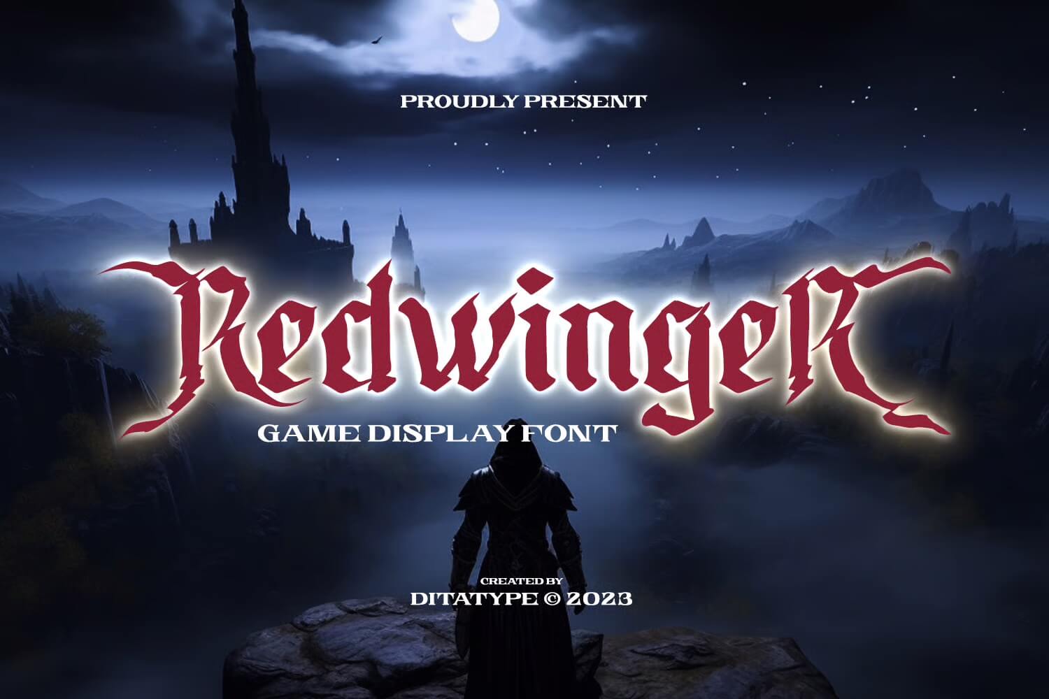
Redwinger has that bold, edgy vibe that instantly grabs your attention. The uneven shapes and sharp details give it a fierce, adventurous look that feels perfect for gaming titles or fantasy themes. It’s playful yet intense, making any design feel alive and energetic.
What are wing fonts, and why are they so popular in modern text design
Whenever I come across a good wing font, it immediately ignites a small flame of joy in me.
The same kind I experienced long ago, when I was just beginning graphic design on my own, during those freelance years.
A feather encircles a character, hidden inside a twist of bird motif, making your text come alive. Wing fonts give it a motion that feels energetic and ready to go on all sides while still remaining contained within two dimensions.
Every time you download a new style, look closely at how the feather forms are drawn, how the lines curve. Or how much detail is integrated with black and white only on paper.
These differences will surprise you. Designers value wing fonts so much because of their ability to bring across a mood.
They make a brand appear charming. romantic or innovative with almost no effort. If you have been seeking a feeling that your regular typeface cannot convey, maybe try using wing fonts!
Where can you download fonts for free without risking strange files?
One of the earliest mistakes I made when I first started collecting fonts was downloading from sources that felt too good to be true.
It taught me quickly that you need safe places to download files, especially if they’re for client work. Fonts with wings are easy to find.
But not every download is safe. Look for trusted sites that offer both free and commercial licenses. That way, you protect your text and your laptop.
Some designers prefer to stick to marketplaces because they come with proper licensing. While beginners sometimes go for free download sites because they are simple.
Whatever your choice, check whether the typeface you pick includes the feather or wing elements you want.
Many fonts call themselves wing fonts but offer only a single icon rather than an actual design element built into every letter.
How do wing fonts change the look and feel of your text design
Each time I add a wing detail to a design, the whole message changes. The letters suddenly feel soft around the edges.
The style leans into movement. and the emotion lifts. Wing fonts do this naturally. because the shapes remind us of flight. freedom. and the lightness of feathers. Even when used in plain black and white. The effect shows.
If you work with creative projects. quotes. invitations. or branding for artistic clients. wing fonts are an instant tool for changing the entire look.
It is amazing how one typeface can transform your normal text into something that looks ready to fly off the screen.
What design projects can benefit from using a wing typeface
I use fonts with wings in a surprising number of places. Sometimes, when I am writing a product description for a digital file, adding a wing feels like adding movement to the text.
Other times, when I am creating templates or branding guides. The soft feather shapes help clients feel connected to the message.
Wing fonts work beautifully for wedding stationery, spiritual brands, poetry layouts, gratitude journals, and pet brands.
Butterfly wings-themed artwork and anything involving dreams, hope, and transformation. This style pairs well with modern handwritten fonts because the curves create a natural flow.
How do you choose the best font with wings without getting overwhelmed
Choosing the best wing typeface used to stress me out. because every download page looked tempting. I would find one with beautiful feathers, one with a bird shape built into the letters. and another with a creative swirl.
Today, my process is simple. I choose a wing font based on three things. First. the look. Does it feel modern, or does it feel too decorative?
Second, the readability. Some wing fonts add too much weight to the letters. Third, the purpose. If your design needs to stay professional, maybe avoid extremely decorative wings. If it is for a creative project, go wild.
Are free fonts good enough, or should you buy premium typefaces
I used to rely only on free wing fonts. because money was tight and I wanted to find as many options as possible. Free downloads are great for experimenting. But premium wing fonts give you better structure and cleaner lines. especially in black and white.
Free fonts often have fewer characters and fewer wing variations. If you are doing professional design, consider investing in at least one premium typeface.
You can still find good free options, but premium files help you deliver work that holds up across formats.
How do you use wing fonts without making your design look messy
Fonts with wings are powerful, but they can overwhelm your design if used everywhere. When I first started. I made the mistake of decorating every letter with a wing.
My whole layout looked like it was about to fly away. Now I use wing fonts with balance so the feather details support the message instead of drowning it.
Use wing fonts for titles, logos, initials, or special accent text. Pair them with a clean modern typeface for the rest of the text. This makes your design look polished and thoughtful.
Can wing fonts mix well with icon packs like bird icons or feather graphics?
Yes, and this is where your creativity can really shine. Wing fonts already include curves and feather shapes, so when you add bird icons or light feather graphics.
The whole design becomes a story. I love adding small bird silhouettes near the corner of a quote. or using a feather icon next to a headline written with a wing typeface. It adds a layered, thoughtful look.
The trick is not to overcrowd the layout. Too many elements reduce impact. Keep just enough to guide the eye.
How to find wing fonts that match your brand’s personality
Every brand has its own personality. Some want a dreamy. soft. butterfly wings sort of energy.
Others want something bold, with strong black-and-white contrast. Your wing fonts need to support that feeling. not fight it.
Start by asking one simple question. Does this font make my brand feel like itself? If not, keep searching.
I like to create a small moodboard, then download two or three wing fonts. place them in the layout. and pick the one that feels natural.
What is the easiest way to add wing fonts to Canva or Illustrator
If you use Canva, it is as simple as uploading your font file under the branding section. Once the font is uploaded. You can use it for any text.
But remember that Canva only allows font uploads for paid accounts. If you are working inside Illustrator, just install the font on your laptop. Restart the program. and search for the typeface.
I usually download fonts into one folder so I do not lose track of them, because my laptop used to be a mess of files. The cleaner your system, the easier your workflow becomes.
This website contains affiliate links. As an Amazon affiliate, I earn from qualifying purchases, our own services and products. This tutorial is an independent guide and is not affiliated with, sponsored, or endorsed by Canva Pty Ltd. All product names, logos, and interface screenshots are used for identification and educational purposes only. Canva is a registered trademark of Canva Pty Ltd. Screenshots are used under fair use for the purpose of commentary and instruction.

